
Recently we released the latest 1.5 official version of Jmix. In this article, we describe the major new features and improvements introduced in version 1.5.
For more details on updating and how to upgrade, please refer to Jmix Documentation recently updated part.
Studio UI/UX improvements
First, let’s take a look at some UI-level changes you may find after updating Studio.
After several rounds of testing with developers who are not familiar with Jmix, we found that the current UI visual designer is a bit too complicated. For first-time Studio users, the three tool windows and multiple XML editing and interface preview panels can easily feel overwhelming. In addition, we found that users prefer to use the operation panel at the top of the current editor window, and are more accustomed to finding available functions by clicking the right mouse button.
Therefore, we decided to remove the static Component Toolbox panel and instead have an interactive mode that opens the toolbox popup in a few different ways.These different ways include: opening from the top operation panel, opening from the right-click menu of the component hierarchy, and opening from the source code editor “generate“ The menu opens. The new toolbox popup supports searching for available components, and also supports dragging and dropping components into the UI hierarchy or source code:
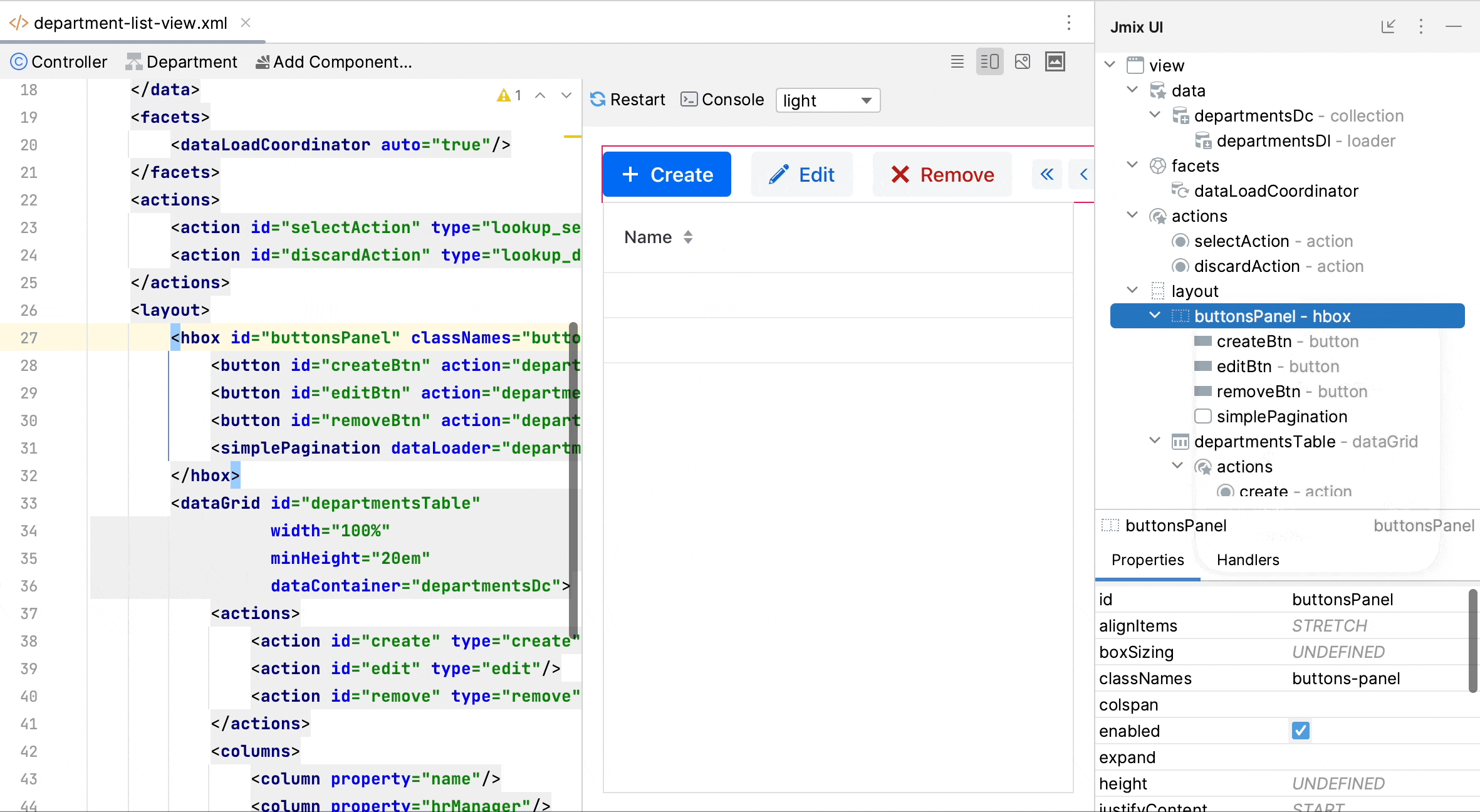
▲ Studio add components
The UI component hierarchy and component properties panel are now merged into a single tool window called Jmix UI, located by default on the right side of the IDE. Therefore, the UI Visual Designer ends up with only one tool window, and the component toolbox can be opened in different ways.
Another not-so-nice feature in the Studio interface is the “Code Snippets“ toolbox. Although this feature is very useful for those without Jmix development experience, it is difficult to notice.Therefore, we have also modified the way this panel is displayed: now, when editing Spring beans or UI controllers, you can use the buttons on the top operation panel or “generate“ The menu opens, and the window of the code snippet is also displayed as a pop-up window.
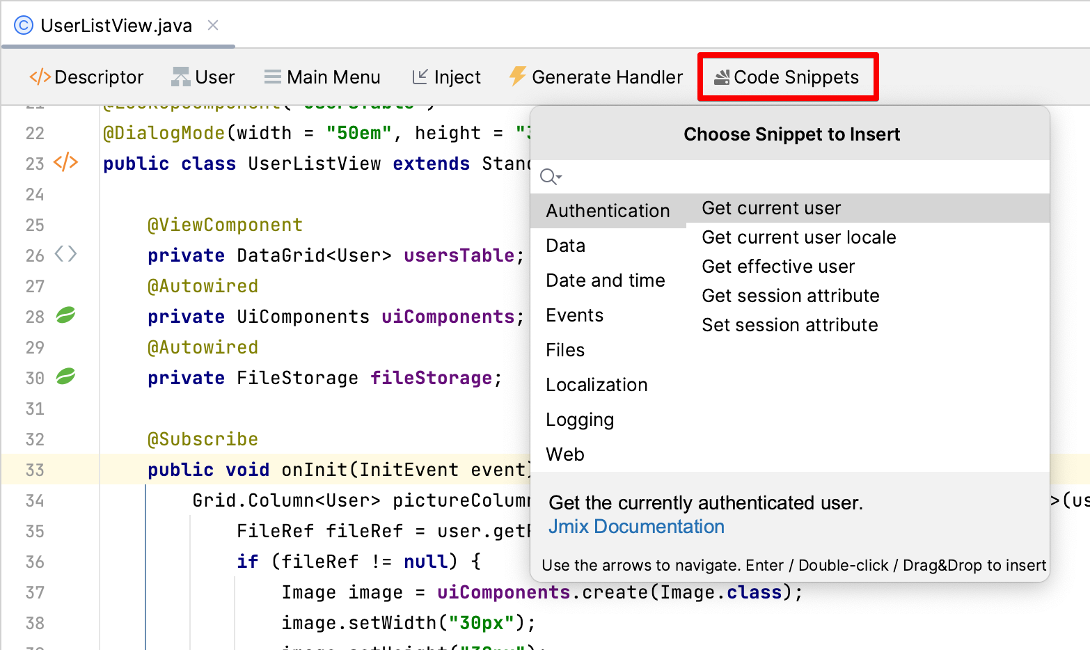
▲ Studio code snippet
Flow UI improvements
We have been continuously improving the functionality of Flow UI, bringing it closer to its goal of being the main UI technology in Jmix.
In this release, we upgraded the core of Flow UI to Vaadin 23.3 and integrated several new components.
Tab Sheet
TabSheet is essential when you need to put a large number of UI components into a single view. The most common scenario for using Jmix is to develop a background system like ERP, and in this system, TabSheet is a typical requirement.
In previous versions, Jmix only provided the Tabs component, which is not a container and needs to be switched programmatically between different layouts. And Vaadin 23.3 provides a full-featured TabSheet, so that we can fully integrate in a declarative way:
<tabSheet width="100%">
    <tab id="mainTab" label="Main">
        <formLayout id="form" dataContainer="userDc">...</formLayout>
    </tab>
    <tab id="additionalTab" label="Onboarding steps">
        <vbox>
            <hbox>...</hbox>
            <dataGrid width="100%" dataContainer="stepsDc">...</dataGrid>
        </vbox>
    </tab>
</tabSheet>
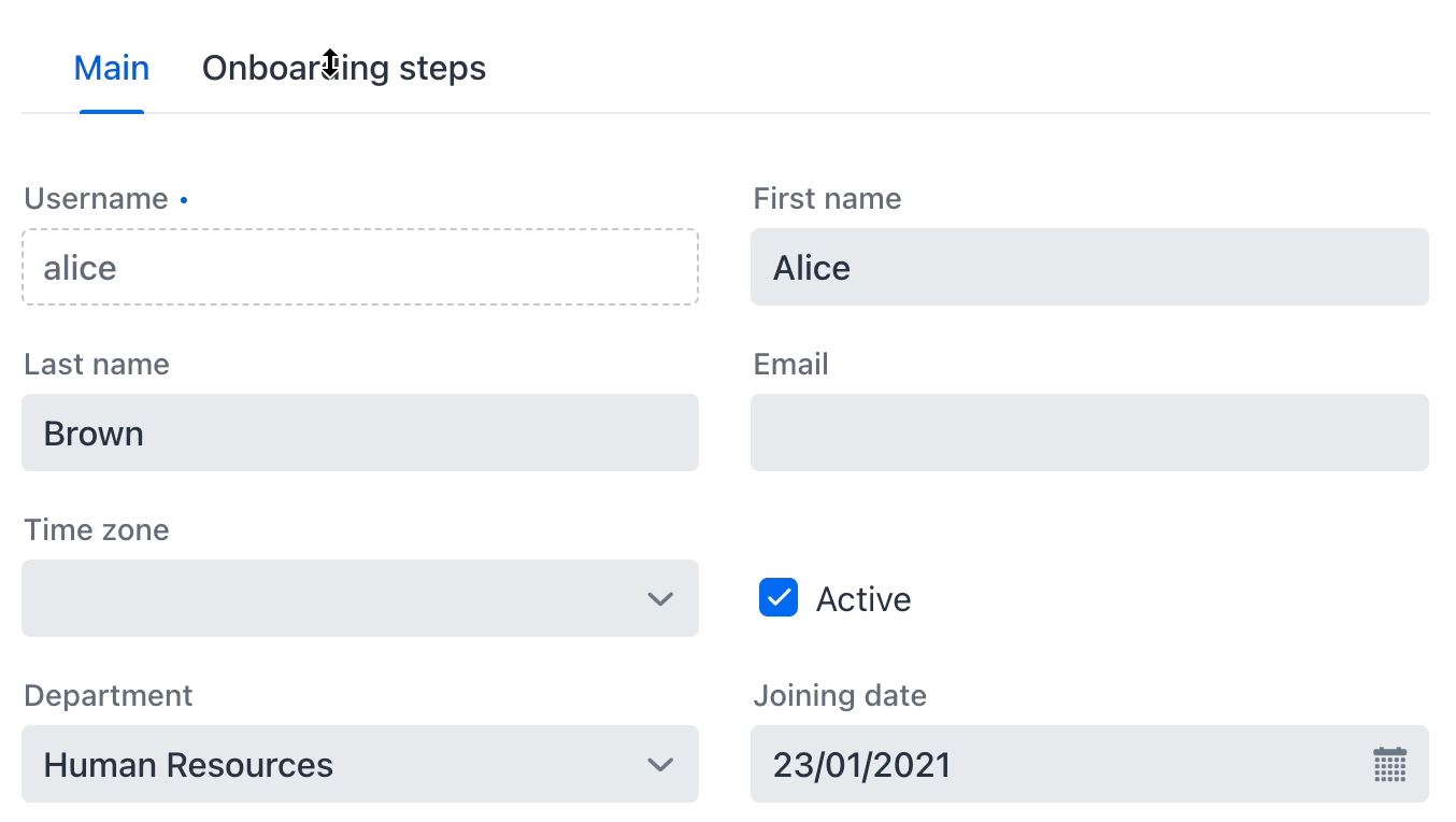
▲ Flow UI TabSheet
MultiSelectComboBox
In the latest Vaadin, a multi-select drop-down box component is also provided. With this component, users can select multiple values in the drop-down list, and the selected content is well displayed in the field. We have integrated this component in Jmix and added data binding, so it can be used to display or modify the collection properties of entities. In the following example, we use this component to manage a many-to-many relationship between products and tags:
<instance id="productDc"
class="com.company.demo.entity.Product">
<fetchPlan extends="_base">
<property name="tags" fetchPlan="_base"/>
</fetchPlan>
<loader/>
</instance>
<collection class="com.company.demo.entity.Tag" id="allTagsDc">
<fetchPlan extends="_base"/>
<loader id="allTagsDl">
<query>
<![CDATA[select e from Tag e]]>
</query>
</loader>
</collection>
<!-- ... -->
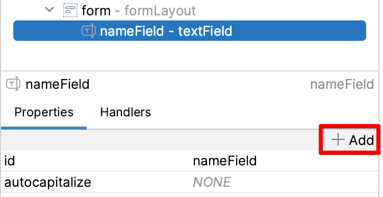
<formLayout id="form" dataContainer="productDc">
<textField id="nameField" property="name"/>
<multiSelectComboBox property="tags" itemsContainer="allTagsDc"/>
</formLayout>
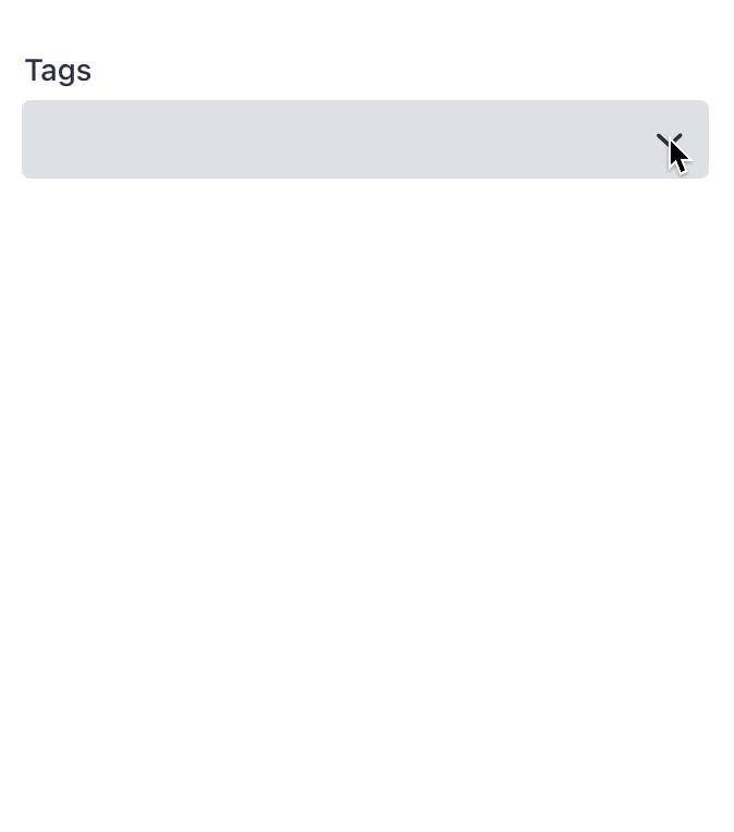
▲ Flow UI MultiSelectComboBox
upload control
Based on Vaadin’s Upload component, we have developed two Flow UI components:FileStorageUploadField and FileUploadField.The previous one is used to upload the file to the file storage, return FileRef Object, which can be stored in entity properties. The latter returns a byte array that is stored directly in an entity.
Declarative usage of these two components is very simple: just set up a data container with an entity instance, and configure FileRef Or the entity attribute name of byte array type:
<fileStorageUploadField id="uploadField"
        dataContainer="userDc" property="picture"/>
picture
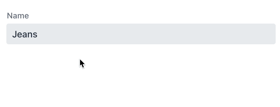
Image components now also support Jmix’s data binding, which can be bound to FileRef or entity properties of type byte array:
<image id="image"
        dataContainer="userDc" property="picture"
        height="280px" width="200px" classNames="user-picture"/>
If you need to configure the placement of pictures, you can use CSS styles.For example, if you need to scale an image while maintaining its aspect ratio, you can create the following CSS class and add it in the component’s classNames Properties specified in:
.user-picture {
    object-fit: contain;
}
Tooltips
Tooltip (prompt window) can display additional information of the component in a small pop-up window next to the UI component. It can be maintained on mouse hover or keyboard focus.
For components that support tooltips, the Studio UI designer will display them in the component properties panel add button:
▲ Flow UI Add prompt window
In XML, it is defined by elements inside the component:
<textField id="nameField" property="name">
    <tooltip text="Product name" position="BOTTOM_START"/>
</textField>
▲ Flow UI prompt window
general filter
Filters are one of the most popular components in Classic UI, allowing users to filter data based on different conditions, including entity attributes, references, JPQL queries, and conditional operators. To use a vivid metaphor, a filter is like a Swiss army knife for structured data search. Developers only need to place filters in the interface, and users can customize and use them as needed.
In Jmix 1.5, we added generic filters in Flow UI with basic functionality: users can create any number of attribute conditions based on the entire entity-relationship graph. Like other components in Flow UI, filters are reactive:
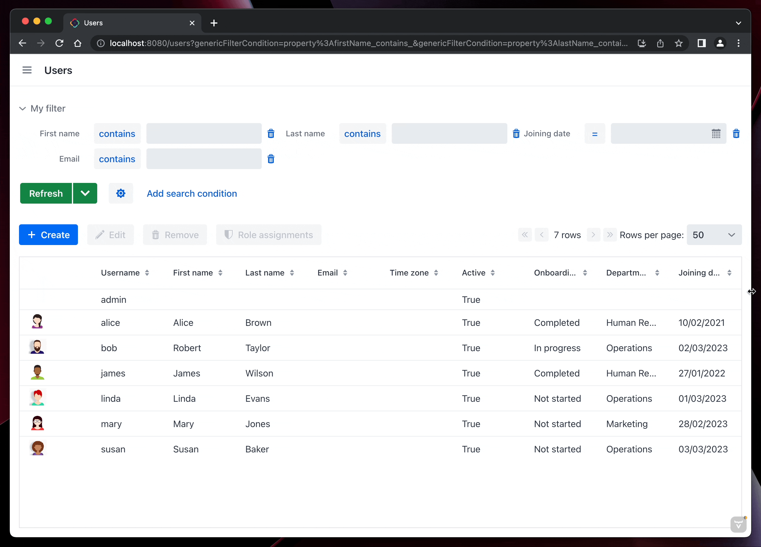
▲ Flow UI Responsive Filters
Moreover, for reactive breakpoints, filters also support XML elements inside responsiveSteps To configure:
<genericFilter id="filter" dataLoader="usersDl"
      summaryText="My filter">
 <responsiveSteps>
  <responsiveStep minWidth="0" columns="1"/>
  <responsiveStep minWidth="800px" columns="2"/>
  <responsiveStep minWidth="1200px" columns="3"/>
 </responsiveSteps>
</genericFilter>
Clearly, filters are stateful and should maintain their state when navigating between views or refreshing the page. Otherwise, the filter conditions set by the user will be lost, for example, when returning to the list page after editing data on the details page. Jmix provides queryParameters facet, which is used to save the mapping between the current URL and the filter conditions, so as to ensure that the filter can maintain the correct filtering state when navigating between different views, and can provide page deep links (Deep link) including filter conditions. The simplest configuration for a Facet is to directly set the filter component it controls:
<facets>
    <queryParameters>
        <genericFilter component="filter"/>
    </queryParameters>
</facets>
The research and development of the universal filter is still going on, and we plan to make the filter of Flow UI have all the functions of the universal UI filter in the June 2023 version.
Extension Components with Flow UI
In 1.5, we provided Flow UI for the following open source components:
multi-tenant
Quartz timed tasks
application settings
Table export operation
In projects using Flow UI, it can be installed directly through Studio’s extension component market.
Flow UI menu
The main menu structure in Flow UI is different from the classic UI: each extension has its own root menu, has a predefined order, and there is no general “admin” menu. For experiments and prototype systems, this default menu structure is sufficient, but for practical applications, a custom menu structure is often required. It is thus possible to switch from “Composite” mode to “Single” mode and define your own menu structure.
Previously, many developers avoided the “Single” mode as much as possible, because it was problematic when adding a new extension to the project: the menu item for the new extension did not appear in the main menu, and it was not clear how to add it .
Now, this problem has been solved in Flow UI’s menu designer. Once switched to “Single” mode, the designer displays a panel on the left with all the menu items of the extension, which are also available in the main menu. In this way, after adding a new extension component, you only need to drag and drop the menu of the extension component to a suitable position in the main menu.
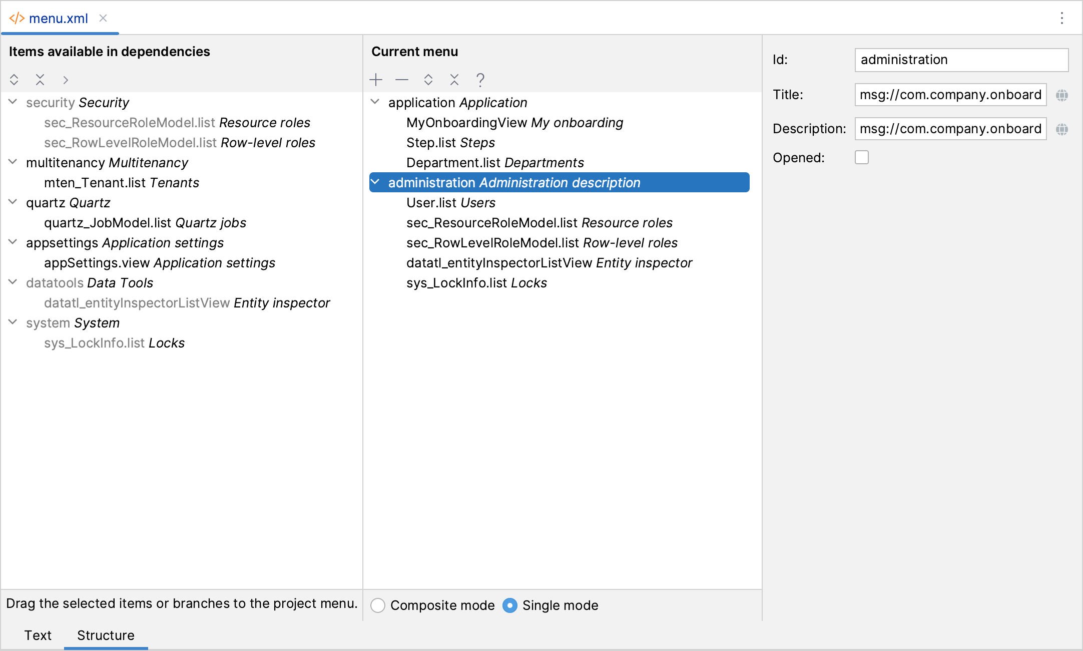
▲ Flow UI menu designer
Excel export
One of the most commonly used functions in the Jmix application is the ability to export the data displayed in the UI table to Excel with one click. This function was originally designed to accurately export all the data that the user can currently see, that is, the data of the current page selected by the filter. But many times users want to export all the data filtered by the filter, not just the current page.
In 1.5, we improved the table export operations extension provided by excelExport operate. Now, if the user selects “All Rows” in the export dialog, all data is exported. Data loading is performed in batches for performance and server memory usage.
This feature supports both Classic UI and Flow UI.
Pessimistic Lock UI
Jmix now provides a default UI for managing pessimistic locks. Located in the Administration menu of the classic UI and the System menu of the Flow UI.
System administrators can view a list of current locks and manually delete them if needed.
Liquibase changelog
One advantage of Jmix is that it helps developers create and run Liquibase changelogs for database version control. Studio generates a changelog for the differences between the data model and database structure, and runs these change scripts when the application starts. Therefore, when a new version of the application is started in a test or production environment, those newly added changelogs are automatically run on the connected database.
However, this simple process does not meet all needs, and sometimes it is necessary to run Liquibase without Studio or an application, for example, to run changelog on a CI server via the Liquibase CLI or Gradle plugin.
In previous versions, this was not possible because the project’s root changelog file did not define the database changes provided by the extension. But the changelog works correctly because Jmix will get the extension component information used from the project configuration and dynamically create the correct changelog in memory before running Liquibase.
Since Jmix 1.5, we have modified this mechanism, the project’s root changelog file is always complete and can be executed by Liquibase CLI or Gradle plugin. Whenever extensions are added or removed, Studio will automatically update the changelog with the new content. Additionally, when the application is launched, Studio checks that what is contained in the root changelog matches the project’s extension components. If a mismatch is found, Studio displays a notification dialog and suggests adding or removing imports to the extension’s changelog.
In the Jmix tool window, the root changelog can be opened by double-clicking the Liquibase node under the data store:
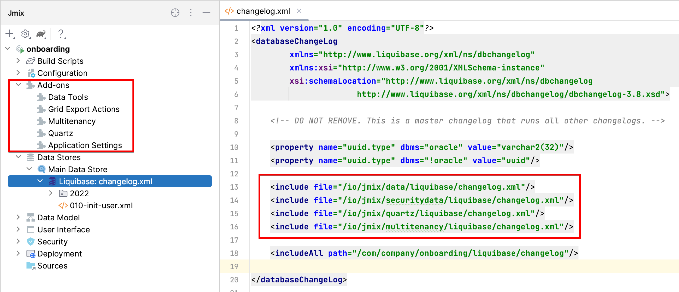
▲ Flow UI root changelog
Next step?
The next functional version of Jmix will be released in June 2023. In this version, we will update the version of the underlying technology stack of the framework, including Spring, Spring Boot, Eclipselink and Vaadin. After this update, a minimum of Java 17 will be required as the baseline version for developing and running Jmix programs.
Another important milestone is the implementation of Flow UI’s interface modules for reporting and BPM extensions.
A detailed roadmap for future releases is available at GitHub project. Subsequent patch releases to 1.5 will be released approximately once a month, providing regular updates and upgrades.
Welcome to our forum Provide feedback and questions. Thank you for your support and suggestions for Jmix!
#Overview #features #Jmix #enterpriselevel #web #rapid #development #framework #code #News Fast Delivery