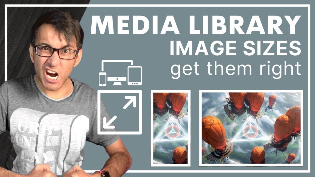
It’s easy to get this wrong when adding and using images from your WordPress Media Library for Websites.
Are you considering device sizes?
Scaling?
Cropping?
Alternate versions for the Desktop and Mobile – or just as standalone image on the page?
NOTE: Since WordPress 6, WP stopped showing the revised KB size (which can confuse many) – but yes, the size on the page will be the refined/cropped/scaled size.
Getting your Image Sizes right with WordPress – Responsive Tutorial – Media Images – Elementor
Book your 1-2-1 Consultation:
Media Library Images – Get them right for responsive devices and screens – WordPress Tutorial
We love to create – share – respond – and deliver.
🧐 Learn with our Mastery Modules:
🔗 All of our Important Links:
😃 Join our Video teaching Group:
😃 Get Code Snippets Pro:
😃 Get Elementor Pro:
😃 Boost your YouTube Analysis:
👕 Get our Merchandise:
🥹 Support us:
Hire us to work on your Website!
💌 info@websquadron.co.uk
👩💻 Visit
