The Ant Design development team stated that, like the previous major version release, they will switch v4 from the main branch to 4.x-stable The branch goes into maintenance state.v4 will continue to be maintained for 1 year, and patches will still be released for bugs, but no new Feature Requests will be accepted after that.Deadline is end of 2023. The original v4 official website moved to https://4x.ant.design/.
design upgrade
In terms of design, we have added 4 types of new components and 4+ variant components based on our own business practices and community voices. These components have been rigorously deliberated to ensure their versatility and scalability. We hope they will bring you good results Use experience. At the same time, we have released some heavy assets that have been used internally for a long time to help you serve more business scenarios.

In addition, in terms of default styles, we have fully upgraded the components. Adhering to the core of happy work, we have upgraded the system vision from three directions: “more focus”, “removal of interference”, and “relaxation”. It involves the optimization and adjustment of multiple global styles such as main color, rounded corners, text color scale, and interactive feedback. In addition, we have also de-lined the navigation frame and almost all components. These changes, in addition to bringing you a new look, are also easier to use in the actual use process. Of course, if you have different aesthetics and appeals for style themes, in 5.0, you can easily customize your own theme with one click based on the style algorithms and configuration tools we provide.


Finally, we are always people-oriented, and we are experimenting with a theme package called “Happy Work”, which contains emotional enhancement components. When users use it in specific scenes, there will be rich but restrained animations to bring users a little “happy feeling”. We hope this is a start, calling on industry design to pay more attention to enterprise-level products, injecting more emotions into cold enterprise-level products to care for our users. The happy work theme package will be launched after the press conference, so stay tuned~
New Design Token model
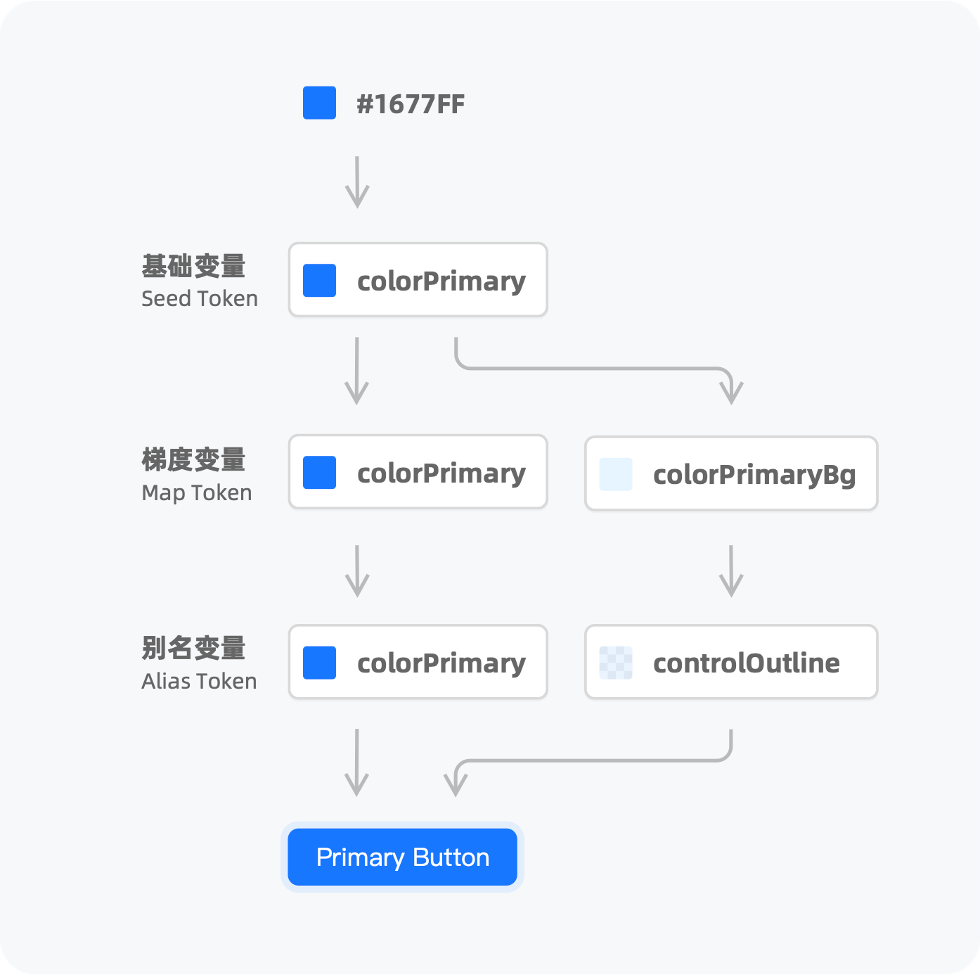
In the v4 version, we propose more less variables to support theme customization. However, except that the color palette supports full derivation capabilities, there are no corresponding algorithms for fonts, line heights, and spacing. In v5, we transformed all Tokens so that all Design Tokens can be derived based on Seed + Algorithm. The new Design Token model supports multi-algorithm pipelines, which greatly reduces the cost of developers’ expansion. You can choose a ready-made algorithm and add your own extended part of the algorithm (of course you can also write a complete set of algorithms) to generate a complete set of Design Token:

CSS-in-JS dynamic themes
In the past we have attempted to provide dynamic theme capabilities through CSS Variables. After a period of exploration, we found that as the complexity of the design system increases, the maintenance cost of its intermediate variables becomes non-negligible. Therefore, in the v4 period, CSS Variables stayed at the dynamic theme color without further providing the dynamic capabilities of dark colors and other Tokens. In v5, as the need for flexibility emerges, we have to face the problem of dynamic themes again.
At the beginning of the v5 launch, we spent several months comparing the current popular dynamic theme solutions: CSS Variables and CSS-in-JS. CSS-in-JS does not need to maintain intermediate variables, but has more runtime overhead (if you are not familiar with this, welcome to read Why We’re Breaking Up with CSS-in-JS). In terms of maintenance costs, we prefer the latter, but we don’t want to compromise the user experience.So after a series of attempts, we developed a set of CSS-in-JS library for component level @ant-design/cssinjs. It obtains higher cache efficiency by sacrificing dynamics, thereby reducing performance loss at runtime.
Through the dynamic theme capability, you can adjust and nest themes arbitrarily through ConfigProvider:
<ConfigProvider theme={{ token: { colorPrimary: 'red' }}}>
  <ConfigProvider theme={{ token: { colorPrimary: 'blue' }}}>
    <MyApp />
  </ConfigProvider>
</ConfigProvider>
It can even be adjusted for a certain component:
<ConfigProvider theme={{
  components: {
    Button: { colorText: 'red' },
  },
}}>
  <MyApp />
</ConfigProvider>
Code examples too boring? You can experience the examples directly on our homepage:

The new CSS-in-JS solution natively supports Tree Shaking, you no longer need to use it in v5 babel-plugin-import Remove unused styles. New schemes will automatically load styles on demand.
more components
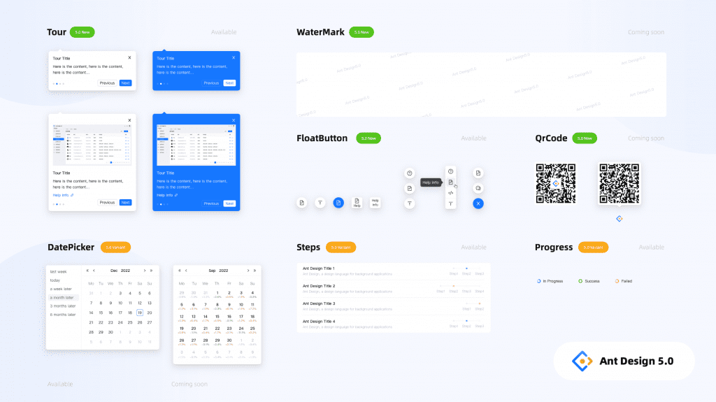
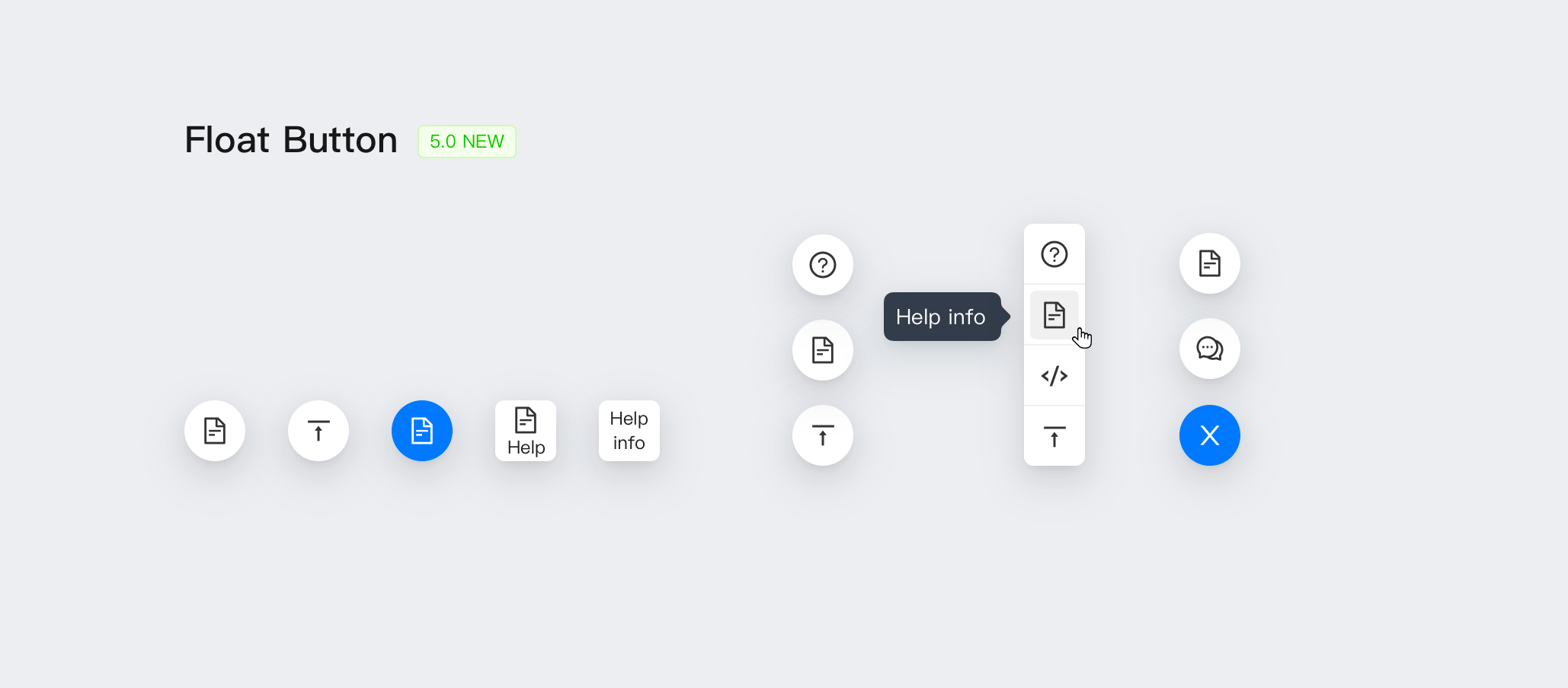
The new FloatButton component is used for global functions on the website, and the original BackTop will be included as its subcomponent:
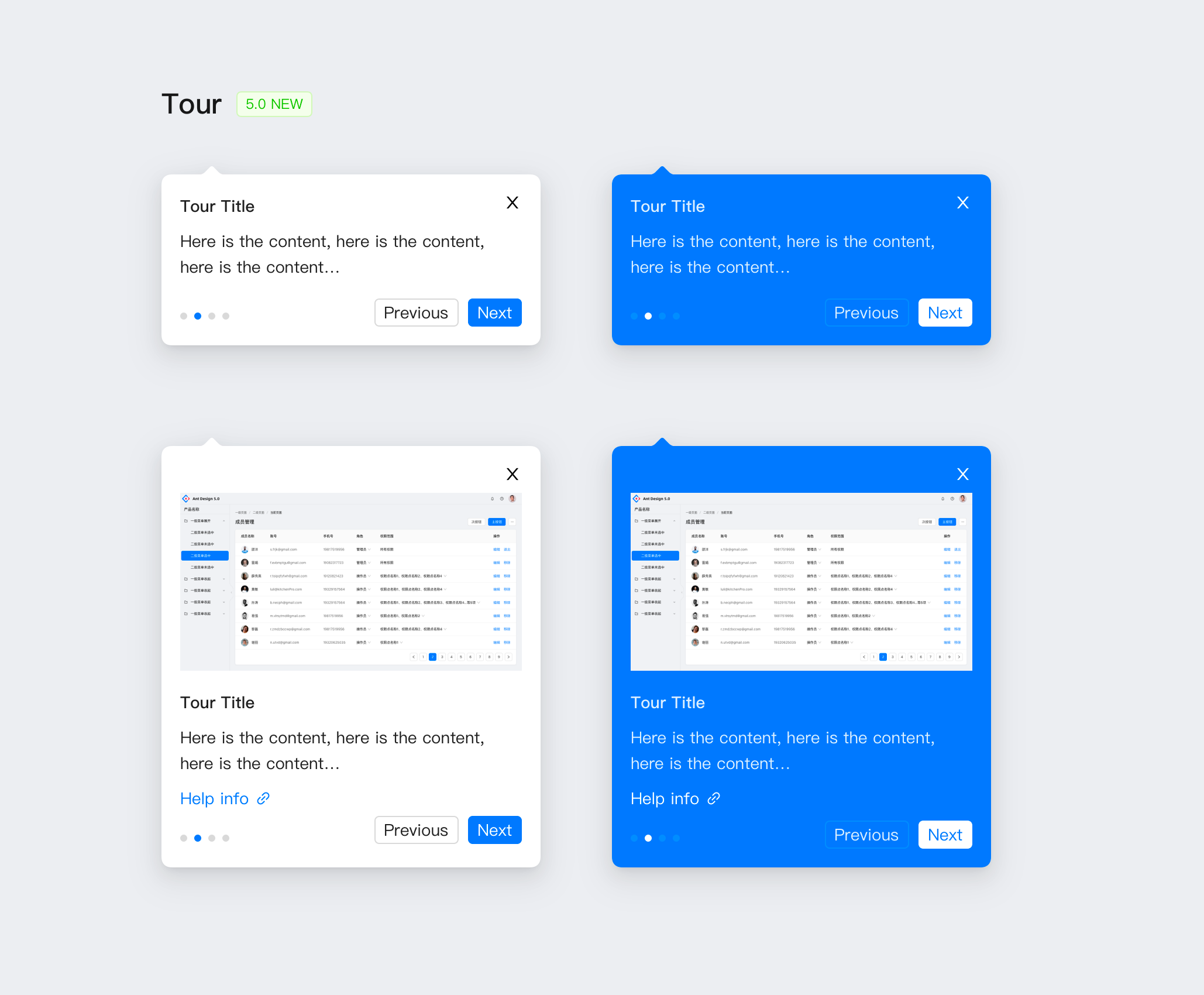
The new Tour component is used to guide users to understand product features:
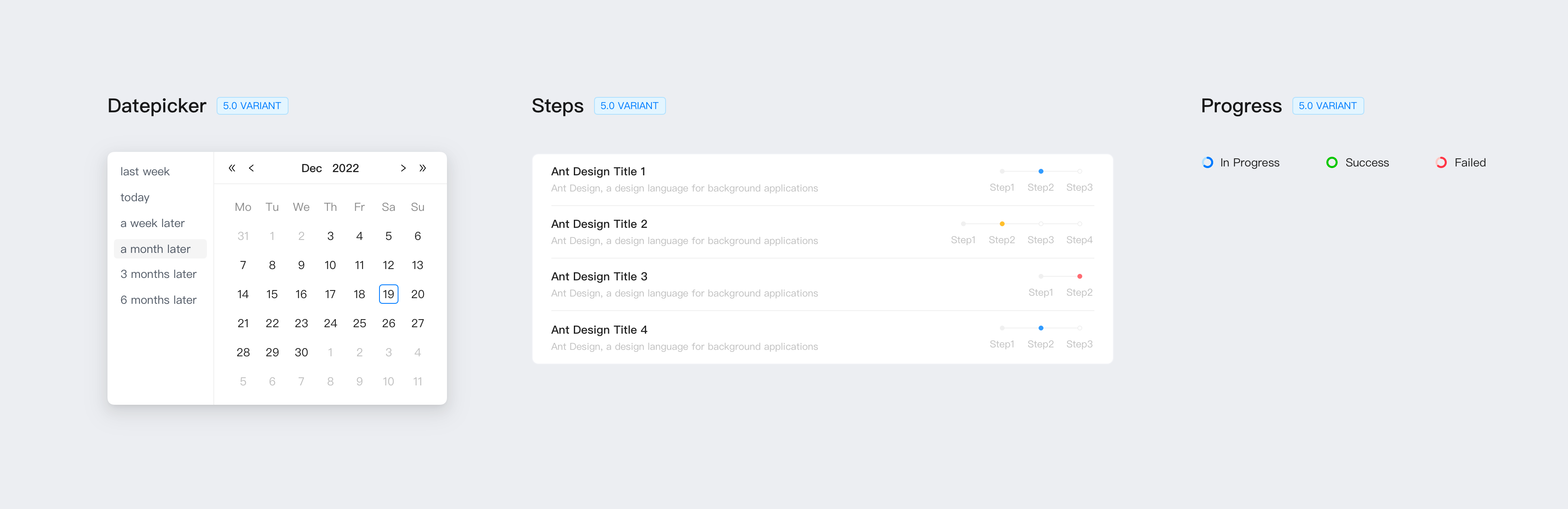
Additionally, we provide variants of some components for inline use:
Compatibility Adjustments
Browser minimum version adjustment
In June this year, IE announced the end of maintenance, so the compatibility adjustment of Ant Design v5 was upgraded from IE 11 to Edge, and other modern browsers remained unchanged. The IE compatibility style code will be removed entirely.So far, we can pass CSS Logical Properties Merge RTL and LTR styles to further reduce maintenance costs.
Default Day.js instead of Moment.js
Moment.js in 2020Convert to Legacy Project. Considering that switching the date library will lead to Break Change, we chose to continue using Moment.js during the v4 period until the end of v4.In v5, we switched to a more lightweight Day.js. In addition to smaller package size, Day.js also brings immutable capabilities.
Of course, if you want to still use Moment.js after the project is upgraded, you can pass @ant-design/moment-webpack-plugin Plug-ins are replaced.
API non-Break adjustments
During Ant Design’s 7-year R&D process, some APIs forked. This causes developers to have additional memory costs, and it also makes it difficult for us to choose when we add new APIs. Originally, we planned to organize and merge a series of APIs, remind developers to migrate APIs in the current version, and remove obsolete APIs in v5 just like upgrading v4 from v3.but afterAfter the community exchangewe decide to change the plan to:Each major version will only adjust a small number of APIs, and the original obsolete APIs will continue to be compatible in the new version, and will be deferred until the next major version to remove. This time we change the following parts, and v5 will be fully compatible with the original writing:
- Pop-up layer components
openandvisibleunified toopenTo conform HTMLSpec. dropdownClassNameandpopupClassNameunified topopupClassNameto be more semantically correct.- Structural syntactic sugar (e.g.
<Select.Option />) to use data-driven instead in preparation for performance optimization. - Deprecated static methods (such as
Message.error), recommend application layer encapsulation to support React 18 concurrent mode.
component removal
v5 will remove the Comment component and PageHeader component, and BackTop will become a subcomponent of FloatButton. Since the Comment component itself does not provide actual capabilities other than styling, developers still need extra work to implement commenting functionality. Also, we decided to remove it from v5 because there are not many actual usage scenarios, but you can still find it in the compatibility pack. The PageHeader component also required some development work to make it work, so we moved it into ProComponents to work with ProLayout to provide real interactivity.
how to upgrade
As mentioned in the compatibility adjustment, since v5 will not do Break Change to the API, you can try to migrate through our codemod tool.For Moment.js you can use our provided @ant-design/moment-webpack-plugin Plug-ins are replaced. If your project depends on antd’s less file, please refer to our migration document for compatibility through less-loader.Detailed documentation pleaseclick hereCheck out.
future plan
We plan to provide more components in the future, some of which are already on the agenda, such as WaterMark, QrCode, and ColorPicker. We have heard enthusiastic calls for Table performance, and we plan to provide virtual scrolling capabilities for the display state, which will natively support fixed column capabilities. In addition, since in v4, we have converged the structural syntax sugar into data-driven attributes, we have a better opportunity to optimize performance, including not limited to Menu, Table, Steps, Collapse, Tabs, Dropdown, etc.
On the design side, we will update the official website to provide more component-level design guidelines, which will be continuously updated by the design team. We have written many articles in the Chinese community in the past, and we hope to take this opportunity to provide English versions of the articles so that international developers and designers can read them together. let us wait and see.
#Ant #Design #officially #released #News Fast Delivery