Xmind announced last month that it officially open-sourced itsDesktop version UI design, and said that this is the first time to share its UI design with the public. Xmind is a well-known mind-mapping software. It is said that Xmind embraces open source again after launching the open source version in 2008.
Xmind wrote in the open source announcement,Minimalism, restraint, lightweightIt is the keyword of Xmind UI design.passuse“Senseless Design”and strive to provide users with a simpler user experience, a smoother interactive experience, and a more barrier-free hands-on experience.Ease of use for novicesalso taking into account the in-depth needs of experienced users.
The following is an excerpt from the Xmind Open Source Announcement.
Lightweight design for ultimate user-friendliness
As an efficiency software, when designing the interfacesimple and efficientbecame our first design principle. We make full use of white space and simple elements to build complex interactive interfaces, making them clear, flexible and highly consistent.
In the interface design we adopted theMinimalism and restraintThere is no trace of redundancy in the interface, only the most practical functions are placed on the software toolbar, and no extra decorations are made to interfere with users. Unlike other traditional software, various functions are full of screen loads, and you will be given a lot of choices when you come in. and oppression.

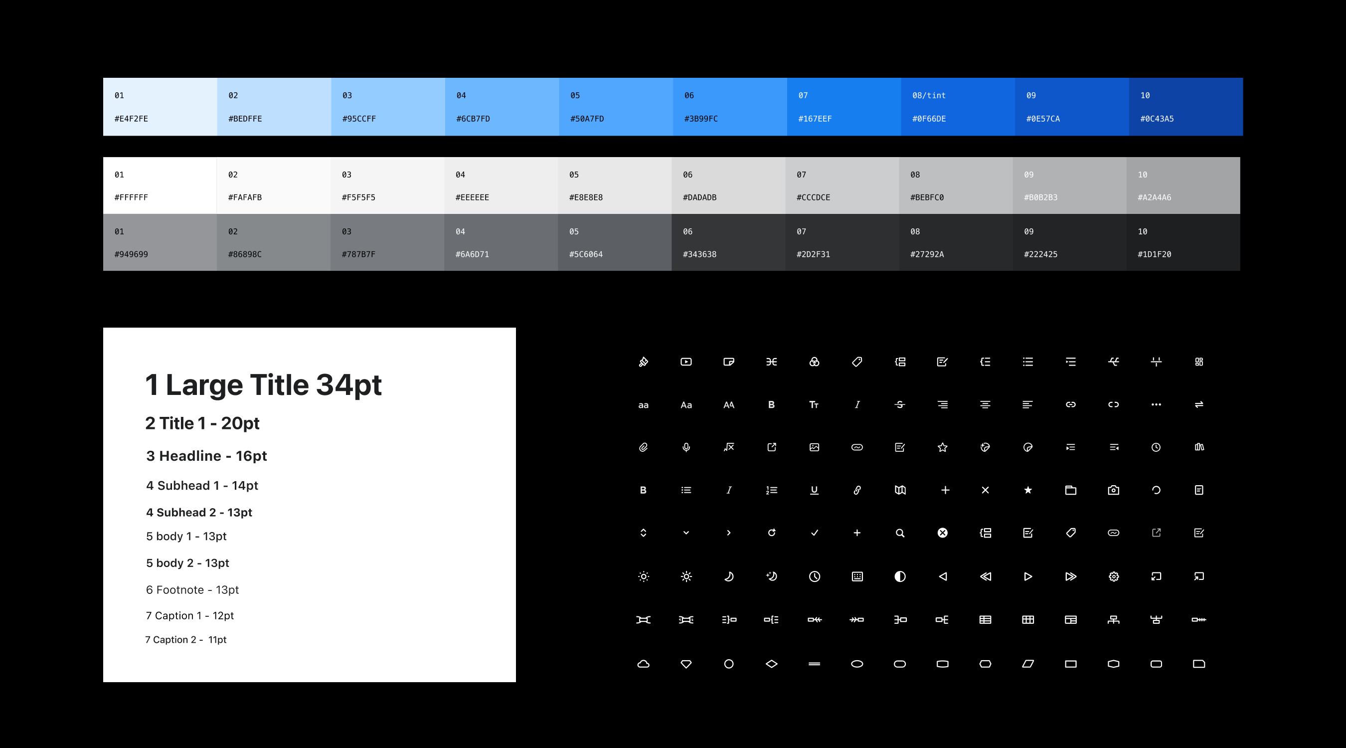
We have adopted an accessible design. In terms of color, the main color matching of black, white and blue is adopted. It does not rely on color to convey information, but adopts a high-contrast visual processing method, which is clean, simple, clear, and clear, and it is effortless in visual recognition. It follows WCAG (Web content is accessible) Sexuality Guidelines) principles to ensure that our users can navigate the interface without any color-related barriers, taking into account the needs of the visually impaired.
In order to facilitate users to recognize and familiarize themselves with the functions of the software faster, the design of the style panel is also the focus of our repeated scrutiny every year. In terms of the functional arrangement of the panel, we have repeatedly considered elements, contrast, text, and spacing to make it have a clear visual hierarchy. Like the mind map, the functional layout of the style panel also has a clear logic, allowing users to pick it up and use it at will, which is extremely friendly to novices.

Different platforms, consistent user experience
Xmind is aCross-platformIn order to ensure that users have a similar experience on each platform, we have considered the unity of component styles and the system itself on different platforms at the beginning of the design, which is in line with the user’s usage habits to the greatest extent, not just for The platform does simple adaptation.
For example, in the design of the toolbar, the top menu bar commonly used in the macOS system is missing in Windows, so we have improved it for the Windows version by adding a menu button on the far left.

Aiming at the difference in the control styles of the two platforms, we differentiate the rounded corners and shadows of various controls in the software on different platforms to make them natural and harmonious. The pop-up mode and arrangement mode of the dialog box are also adjusted accordingly for different platforms.

On the premise of adapting to the design specifications of different systems, it maintains the design style of Xmind to the greatest extent, maintains the user’s familiarity, and reduces the user’s operation and cognitive costs.
Invisible design, fine grinding
fineis another keyword of Xmind design. In order to let everyone have a better experience, we have worked hard on every detail of the software. As small as a checkbox, a sticker, and even in various marginal situations, sufficient consideration has been made.
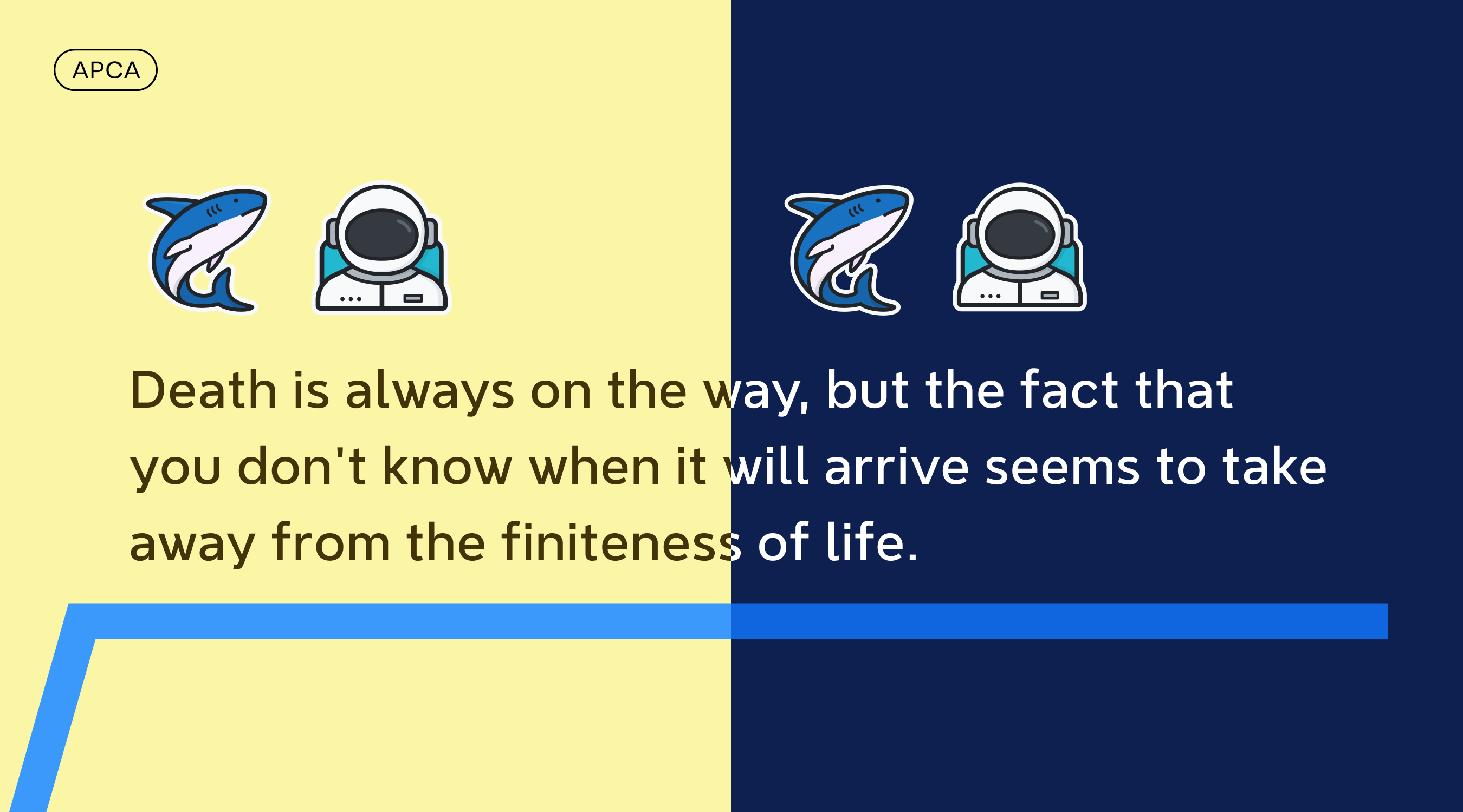
For example, in the smart color scheme, if you remove the background color of the mind map, we will set the reverse color for the font according to the perceptual contrast algorithm (APCA), so that you can ensure the readability of the text under various background colors.
In order to optimize the user’s printing experience, we have addeddouble strokeTo enhance the recognition, so that it can be well presented in the printing scene with dark background and light background, and the black and white printing mode of the mind map itself has also been optimized.
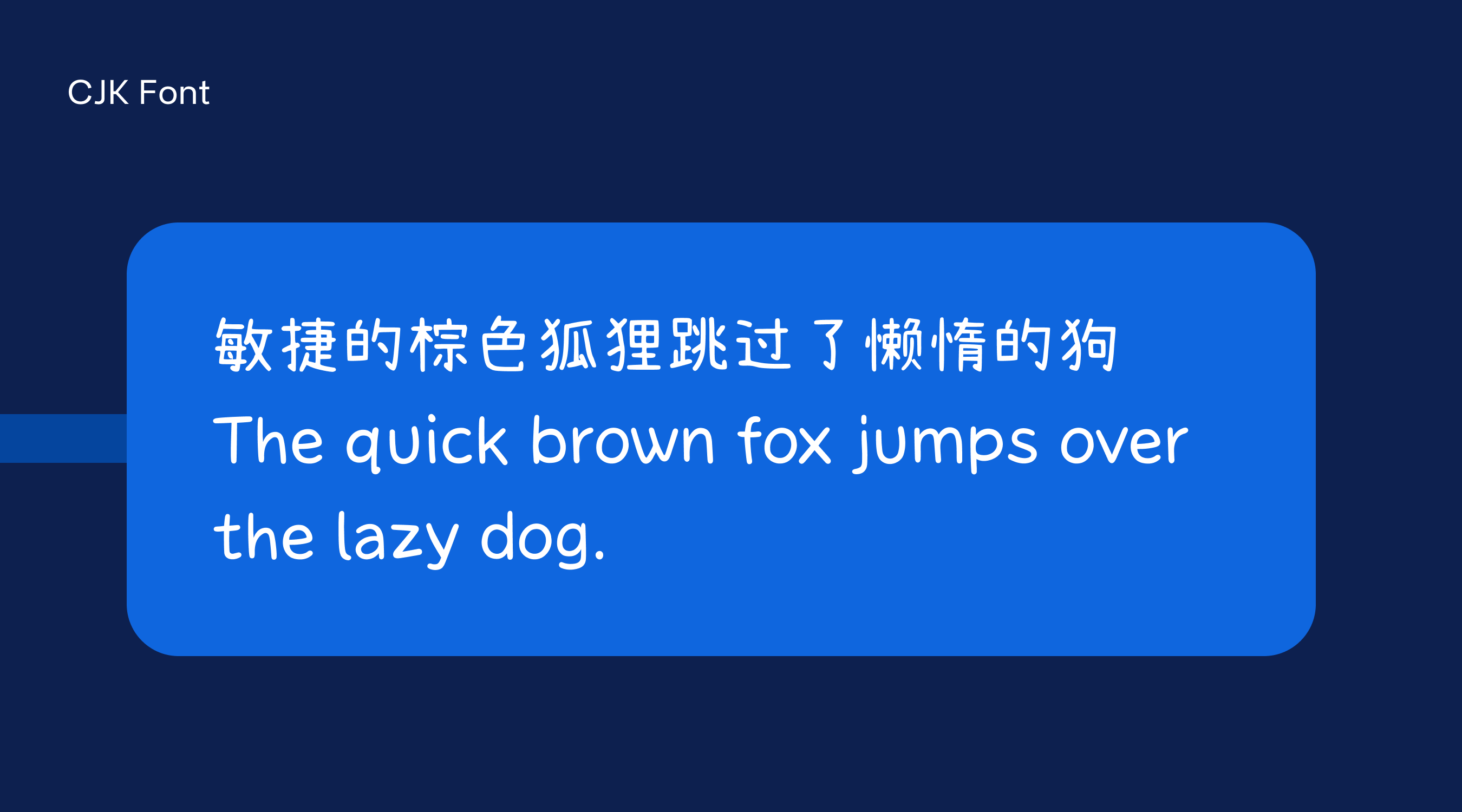
In terms of fonts, in addition to our self-developed brand font NeverMind, we also provide Chinese, Japanese and Korean font (CJK font) settings, so that when Western language characters and Chinese, Japanese and Korean characters are mixed, they can be set respectively. Fonts are used to achieve a better combination and use effect, and it also avoids the problem of missing characters caused by some Western fonts not supporting Chinese, Japanese and Korean characters.
In Xmind, users can know how many themes they have created at any time, the software can automatically adapt to the light and dark appearance of the system, language switching can also be switched within seconds in the software, and the software font can also automatically follow the system font size change Wait. These details may not be easily perceived by users, but they are the result of our careful thinking and design.

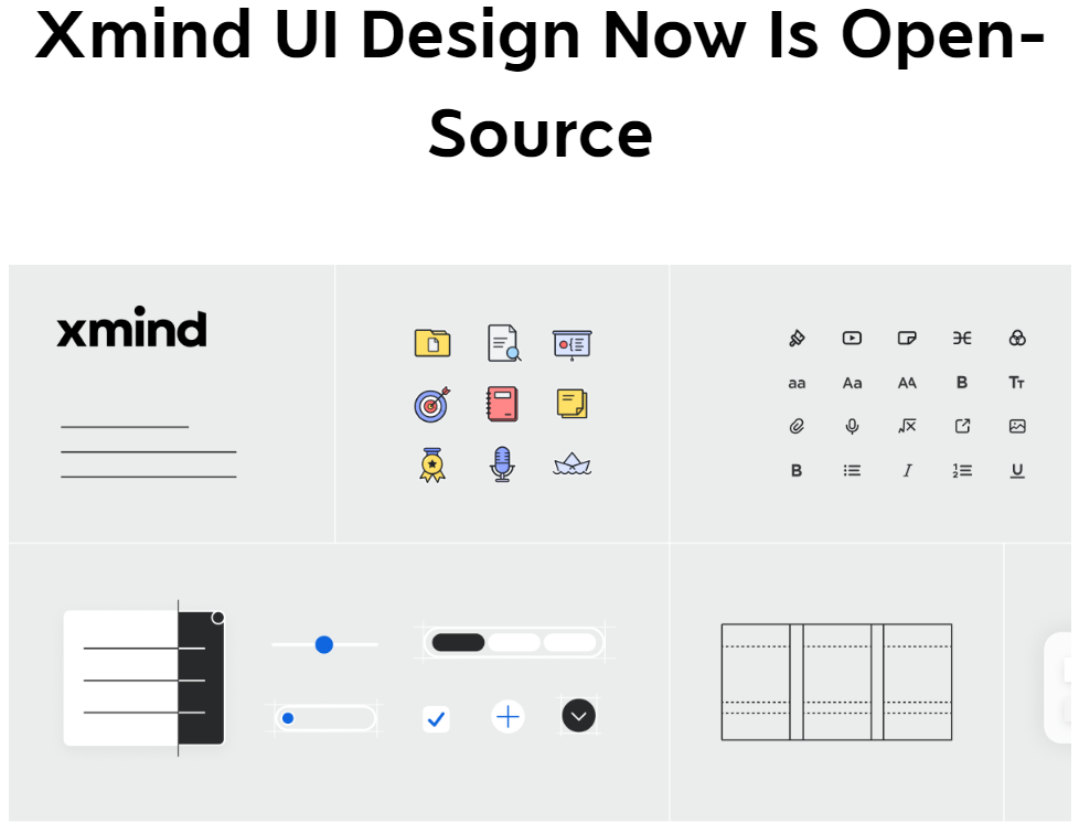
How to use Xmind UI Design Toolkit?
Xmind’s UI Kit includes components designed by Xmind, templates, fonts, stickers and other elements that make up the UI design of the Xmind desktop version. Click Xmind desktop version UI Kit to get all the above resources.

#Xmind #Open #Source #Desktop #Design #News Fast Delivery